jasons
Level 4 Theurgist
 
Posts: 111
|
Post by jasons on May 15, 2011 8:18:19 GMT -6
Somebody had to start one! Here's a pic for a collection of magic items... 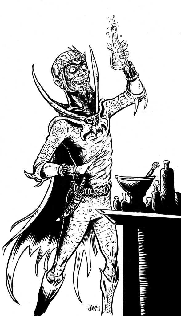 He's wearing his favorite lounging-around-the-tower pajamas and yes, that's some kind of third-eye-enhancing apparatus on his head. A question for all of those more tech savvy than myself (that's everybody, as far as I can tell): What is the ideal file type, dpi, and all that for your Fight On! art submissions? Especially as regards print results, as I've discovered that some of my pics look fine in the PDF but distinctly less so in the Lulu hard copies. Any help would be greatly appreciated! |
|
|
|
Post by calithena on May 15, 2011 8:54:19 GMT -6
300 dpi jpegs normally seem to work pretty well. There is one thing that you absolutely want to avoid, which is flat/clear (?) rather than white picture backgrounds - kensanata can maybe provide the details next time he comes around.
|
|
|
|
Post by kelvingreen on May 15, 2011 9:01:43 GMT -6
I've been sending pngs of late, as they're of higher quality than jpgs -- no artefacts, for example -- but aren't too much bigger in terms of file size. I'm not sure if they create a problem at the other end, but I've not had any complaints thus far!
|
|
nezach
Level 3 Conjurer
 
Posts: 87
|
Post by nezach on May 15, 2011 21:43:44 GMT -6
It is a generality or rule of thumb that print graphics should be 300 dpi while 'screen' graphics only need to be 72-100 dpi. This could be the cause of the shift in image quality you see from pdf to print jasons.
Jpegs and pngs both use compression to shrink file size. the issue with the jpeg compression is that unlike most others it is lossy. It throws out a certain amount of info depending on how you save the file an then destructively 'averages' the rest in grids. On hard edged images (an example totally picked at random: high contrast black and white illustrations) there can be very perceptible 'halo' of artifacting as some of the info from one value gets averaged in with that of the other in the grids that run along an edge.
FO! seems to be a case where you want both a print quality image but not print quality bloat, so something like png, which has a few different options that make it great for black and white work, but able to produce photographic values as well without ballooning too much, might be the way to go.
|
|
nezach
Level 3 Conjurer
 
Posts: 87
|
Post by nezach on May 15, 2011 21:51:06 GMT -6
I'm still not sure of the protocol around here, but this thread looks like something to do with art and FO! #12 so here's an image of the power armor reptile guy I submitted for said magazine. 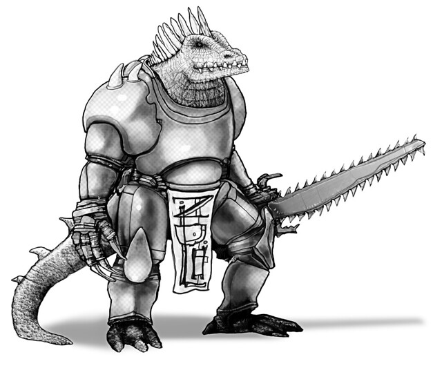 |
|
|
|
Post by kelvingreen on May 16, 2011 1:32:08 GMT -6
That is brilliant! It wouldn't be out of place in one of those lush French scifi comics like Metabarons, although my favourite bit is the design on the loin-flag-thing.
How did you do the textures, particularly the reptile scales and the BenDay dots on the armour?
|
|
|
|
Post by calithena on May 16, 2011 5:28:51 GMT -6
I have never had any trouble with Kelvin's pics, FWIW.
|
|
nezach
Level 3 Conjurer
 
Posts: 87
|
Post by nezach on May 16, 2011 9:23:55 GMT -6
That is brilliant! It wouldn't be out of place in one of those lush French scifi comics like Metabarons, although my favourite bit is the design on the loin-flag-thing. How did you do the textures, particularly the reptile scales and the BenDay dots on the armour? Metabarons was a great comic. I'm flattered anyone would link the two (did anyone ever play the RPG?). The textures come down to Photoshop hack work. If I recall the dots are just a halftone pattern filter on a filled layer set to soft light or overlay. I've been using that a bit much lately. The texture on the head was pretty much done by hand. Then I noticed the tail really had nothing but basic shading so I lazily dropped a couple of leathery hide textures from my collection on there. It made the texture on the head look crappy by comparison so I blended in some of the tail texture into the head to unify them a bit. The graphic on the cloth was an afterthought. It needed something so I added my signature , which is already pretty impressionistic, sideways with some embellishments. |
|
jasons
Level 4 Theurgist
 
Posts: 111
|
Post by jasons on May 16, 2011 9:24:09 GMT -6
Thanks for the info, folks. I've been using tif files, thinking they were better for print, but I'll try the png route. Maybe something with the tif setting? Could it be my ancient outmoded photoshop?
|
|
nezach
Level 3 Conjurer
 
Posts: 87
|
Post by nezach on May 16, 2011 9:57:11 GMT -6
Yeah, tiff files can be a bit tricky. It's still a workhorse of a format due to it's extensibility, but sometimes its flexibility can be problematic. They can act like a container for other files in some cases, kinda like a pdf. With the proper setup a tif could actually contain a jpg (complete with lossy compression) or even vector type stuff. It's also been around for a couple of decades now and has several different specifications floating around.
|
|
|
|
Post by kesher on May 16, 2011 10:34:02 GMT -6
Is it me, or does the art just keep getting better?
jasons, that is pure Otus goodness--his expression is priceless!
nezach, splendid as always! The sword is awesome, and you can really feel the density of the figure as a whole.
The discussion around file types is always useful. Personally, I've been sending in any pen and ink illos as 300 dpi jpgs, and any pencil drawings as 600 dpi jpgs, which seems to have worked out pretty well in terms of how they look in print.
*and apparently I don't even know how to spell "jpeg"...
|
|
|
|
Post by kesher on May 16, 2011 10:45:34 GMT -6
Here's the robot being worked on by my friend Lawrence: 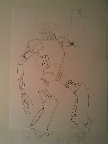 |
|
nezach
Level 3 Conjurer
 
Posts: 87
|
Post by nezach on May 16, 2011 16:35:10 GMT -6
Here's my take on the banshee. 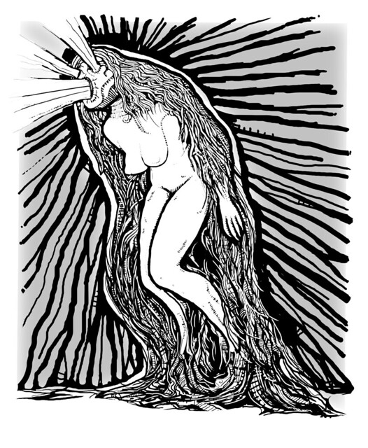 |
|
jasons
Level 4 Theurgist
 
Posts: 111
|
Post by jasons on May 16, 2011 18:15:45 GMT -6
That rocks! It looks like its encysted in some kind of amniotic sac of pure terror!
|
|
Alex Schroeder
Level 4 Theurgist
  I like my boring fantasy setting
Posts: 182
|
Post by Alex Schroeder on May 17, 2011 17:20:58 GMT -6
I've had a bad experience with TIFF files at a local printer. I had created a file with layers in Gimp, saved it as TIFF and sent it to the printer for 5000 flyers which turned out to look wrong. I will never do that again!
My PNG problems with Fight On! were due to transparency. JPG files cannot have transparency, but PNG files can, if you add an alpha channel. If you just scan an image and save it as PNG you are probably fine. What I did was scan it, import it into Inkscape, trace it, zoom it, and export it again. The resulting PNG was black lines on transparent background, so the PNG had an alpha channel and transparency. Strangely enough this resulted in huge PDF file sizes and absurd memory requirements while printing, resulting in Lulu taking down PDF files containing such images.
These days, just to be sure, I submit all my art as 300dpi JPG files. Basically I try to send everything at around 3000x2000 pixels and use the default quality setting in Gimp.
|
|
|
|
Post by kelvingreen on May 18, 2011 2:59:19 GMT -6
There is an option in GIMP -- I think it's Image>Flatten Image -- which combines layers. I don't know if it combines channels though. Since it's not under the Layers menu, I'd guess it does, but I don't know for sure as I don't tend to use channels.
|
|
nezach
Level 3 Conjurer
 
Posts: 87
|
Post by nezach on May 18, 2011 10:24:10 GMT -6
There is an option in GIMP -- I think it's Image>Flatten Image -- which combines layers. I don't know if it combines channels though. Since it's not under the Layers menu, I'd guess it does, but I don't know for sure as I don't tend to use channels. To delete the alpha channel completely use Layer > Transparency > Remove Alpha Channel The only other thing that I can think of that would lead to unexpectedly huge PNG files is inadvertently saving one out as 16 bits per channel instead of 8, but I don't believe GIMP or Inkscape has that capacity yet. |
|
jasons
Level 4 Theurgist
 
Posts: 111
|
Post by jasons on May 18, 2011 14:59:26 GMT -6
Great info, peoples. Thanks!
I'm currently using antique photoshop 7. I am reluctant to try GIMP, though I've heard many wonderful things, for fear that its learning curve will set me back zillions of man-hours getting a handle on it. I'd love to be wrong about this!
|
|
nezach
Level 3 Conjurer
 
Posts: 87
|
Post by nezach on May 18, 2011 18:46:58 GMT -6
Hey jasons, there is a hack of GIMP out there called GIMPshop that was a modification to bring it in line with the look and feel of Photoshop that might help ease the transition.
I don't know how well maintained it is anymore. There was some drama with someone setting up GIMPshop.com that had the name of the guy who did all the work on it and links to the legit software but was ran by someone else who had donations buttons out and everything to cash in on the other guys work. Basically the guy who did the hack stopped updating in disgust after unsuccessfully trying to get the other guy to stop, but I think there were some others who tried to carry on with the project. Anyway, might be worth checking out.
|
|
|
|
Post by kelvingreen on May 19, 2011 1:43:46 GMT -6
I went from Photoshop... 6 I think, straight to GIMP, and I had no problems catching up. They were quite different back then, too, and they seem to have become more similar of late, so I wouldn't worry too much about the transition.
Of course, I say that as someone who only uses very basic features of the program; if I were more of an advanced user, I might find it more difficult to make the move.
|
|
|
|
Post by germille on May 23, 2011 18:39:38 GMT -6
is this the request thread?
i would like to draw some requests for the next one.
|
|
|
|
Post by calithena on May 23, 2011 18:55:09 GMT -6
|
|
jasons
Level 4 Theurgist
 
Posts: 111
|
Post by jasons on May 24, 2011 18:09:44 GMT -6
Thanks nezach and Kelvingreen. Here's another pic, this one submitted under the "classic/intro D&D" category on the FO #12 art request listing. 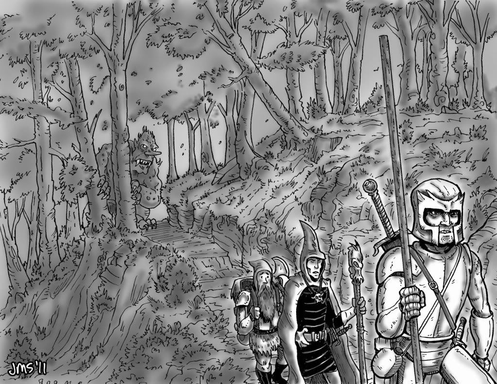 |
|
marjasall
Level 3 Conjurer
  Fantasy Illustrator
Posts: 57
|
Post by marjasall on May 24, 2011 19:25:00 GMT -6
Thanks nezach and Kelvingreen. Here's another pic, this one submitted under the "classic/intro D&D" category on the FO #12 art request listing. Nice! This is an excellent drawing. |
|
|
|
Post by kelvingreen on May 25, 2011 1:10:53 GMT -6
I love all the detail in the background. You didn't just settle for some token bushes and a couple of tree silhouettes, which is probably what I would have done!
|
|
ant
Level 5 Thaumaturgist
  
Posts: 243
|
Post by ant on May 25, 2011 3:43:09 GMT -6
I love this, jasons.
Also, 10' pole!
|
|
|
|
Post by kesher on May 25, 2011 7:54:55 GMT -6
Awesome--I love that the dwarf looks nervous! And bonus points for the magic user's Otus Hood...  |
|
|
|
Post by labsenpai on May 25, 2011 18:47:24 GMT -6
Here is a battle pic (sloshing in slime again) for the new Darkness Beneath. I need to put down the brush and pick up the pen point before I lose detail get lazy.  Uploaded with ImageShack.us |
|
|
|
Post by kelvingreen on May 26, 2011 10:30:50 GMT -6
I love the chunky linework, and how you've used the blacks to create a multi-layered feel to it. Very nice indeed.
|
|
|
|
Post by kesher on May 26, 2011 10:38:30 GMT -6
Really nice texture---looks almost Kirbyish to me!
|
|