|
|
Post by tdenmark on Aug 6, 2021 16:16:55 GMT -6
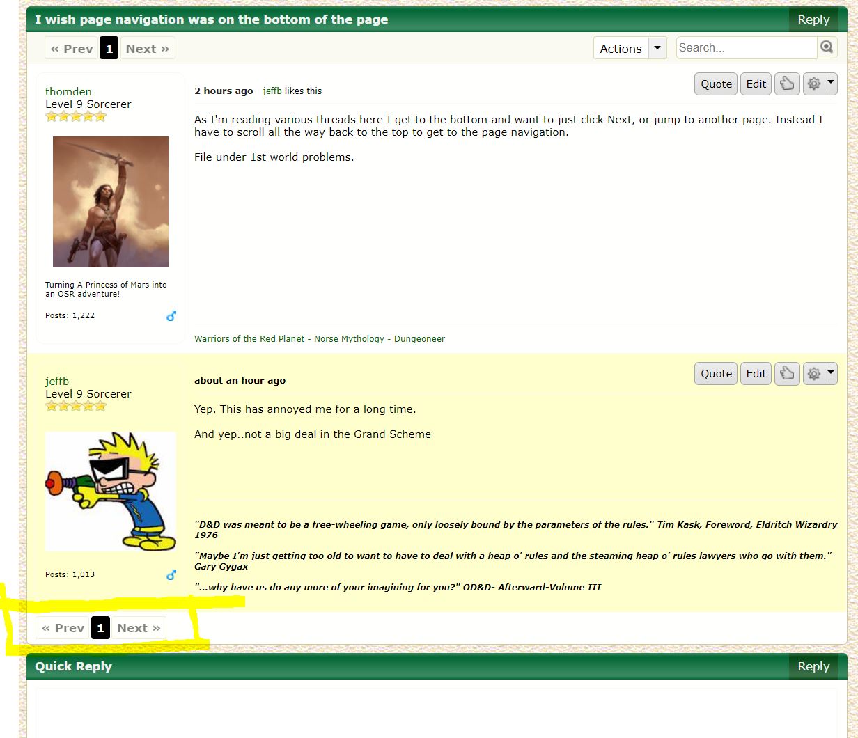
As I'm reading various threads here I get to the bottom and want to just click Next, or jump to another page. Instead I have to scroll all the way back to the top to get to the page navigation.
File under 1st world problems.
|
|
|
|
Post by jeffb on Aug 6, 2021 17:17:52 GMT -6
Yep. This has annoyed me for a long time.
And yep..not a big deal in the Grand Scheme
|
|
|
|
Post by waysoftheearth on Aug 6, 2021 18:24:30 GMT -6
So... you're not seeing the yellow highlighted buttons at the bottom of this image?  |
|
|
|
Post by jeffb on Aug 6, 2021 18:58:11 GMT -6
No. Not on Google or on Edge.
It stays at the top as you scroll, then disappears as you scroll all the way to the bottom.
|
|
|
|
Post by tdenmark on Aug 6, 2021 19:52:47 GMT -6
So... you're not seeing the yellow highlighted buttons at the bottom of this image?  No, that is would be handy. I just wiped my cache and updated Chrome, and notice the navigation is now staying at the top when I scroll. |
|
|
|
Post by waysoftheearth on Aug 6, 2021 21:37:46 GMT -6
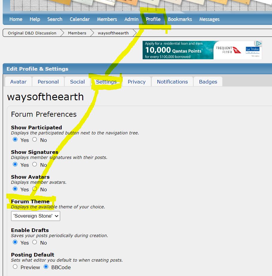
Okay, I figured it out. Additional navigation links at the bottom of the page are part of the custom skin/theme I'm using. The default Proboards skin/theme doesn't have this feature. To switch to the theme with navigation links at the bottom of the page: 1. Go to: Profile -> Settings -> Forum Theme. 2. Select the "Sovereign Stone" theme. 3. Click save. Done.  |
|
|
|
Post by tdenmark on Aug 7, 2021 0:07:25 GMT -6
Okay, I figured it out. Additional navigation links at the bottom of the page are part of the custom skin/theme I'm using. The default Proboards skin/theme doesn't have this feature. Woah, that gives the board a very different look! I'm not sure how I like it. Will take some getting used to. Thanks for figuring that out. |
|
|
|
Post by Zenopus on Aug 7, 2021 7:16:41 GMT -6
I see the buttons on the bottom on mobile view (Chrome/Android), but not on desktop view on the same device.
|
|
|
|
Post by jeffb on Aug 7, 2021 7:54:27 GMT -6
Green is my fave color, but I never could get used to the SS theme here when I tried it.
I actually thought the blue and white theme was specific to these boards because it represented old school module dungeon maps.
|
|