|
|
Post by everyfan on Jun 4, 2019 9:03:35 GMT -6
I'm in the process of starting up an OD&D campaign. I don't want my dungeon do be a standard flat rooms with everything the same height affair; I want to have height variations within rooms and between different parts of the dungeon level. But, I'm not sure how to show that on the dungeon map. I've thought about using dashed lines within rooms, but I don't think that would explain very much; I've also thought of using an isometric map, but I think that would end up being pretty confusing to draw, and also would take up more room on the paper for less map.
What do you all do to represent this?
|
|
flightcommander
Level 6 Magician
   "I become drunk as circumstances dictate."
Posts: 387
|
Post by flightcommander on Jun 4, 2019 21:05:35 GMT -6
"Map pencils", you say?
|
|
|
|
Post by Finarvyn on Jun 5, 2019 3:25:01 GMT -6
Yes, lighter colors for higher elevations, darker for lower. I tend to use orange and purple, respectively; but it depends upon how many variations of height I have. I was going to suggest this very idea. If you have seen topographic maps of the bottom of the ocean (or even some gaming maps, like the Greyhawk one from Gary's folio and boxed set) the top of the ocean is clearly flat but they use various shades of blue to indicate depths. Lighter blue for less depth, darker blue for greater depth. Same thing would work for above ground, only in different colors. |
|
|
|
Post by everyfan on Jun 5, 2019 6:48:29 GMT -6
My issue with using different colors is that I don't believe my current collection of colored pencils erases nicely, and of course an OD&D dungeon must be updated over time.
|
|
|
|
Post by Vile Traveller on Jun 6, 2019 4:16:20 GMT -6
Landscape architect hat on.
Line weight is very important in 2D graphics to show the difference between real edges, or patterns, or edges of paving slabs, or trapdoors, or furniture ... you get the picture. You can show shadows with even thicker blak lines, no need to make them very wide but do be consistent about the direction in which they are cast - I usually go north-east. I advise investing in a set of pens of different thicknesses.
Levels in architectural practice are shown as + or - to a baseline of zero. So an area with "+3.5" written on it is 3.5m higher than the baseline. Now in a real project there is only one "0", but in dungeons I give each level a zero baseline and go from there. I also use feet instead of metres.
I'm on the MTR but I'll try to post an example of what I mean later.
|
|
|
|
Post by talysman on Jun 6, 2019 11:26:06 GMT -6
You might want to check out Dyson Logos's maps for some tricks you can use to show level changes. The ones I've adopted: - Stair "steps" get narrower in the "Down" direction, and a box around the narrow end means "down to another map on another page".
- If there is a room or corridor partially or wholly underneath another, show its outline with a dashed or dotted line.
- Parallel lines, or better yet parallel narrow triangles, show the edge of a cliff or ledge.
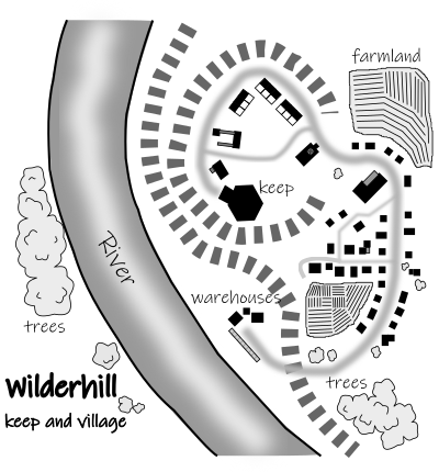
I haven't fully transitioned from parallel lines to the narrow triangles for #3 yet. Here's an example from an outdoor map I recently did:  The land on the east bank of the river rises slightly, and then there's a hill with a keep on top. I used the parallel grey bar lines essentially the same way you'd use contour lines on a relief map. Which side is high and which side is low is reasonably obvious, but it would be even better if I used narrow triangles in place of the bars, with the apexes pointing to the low side. |
|
|
|
Post by scottenkainen on Jun 6, 2019 20:05:54 GMT -6
I just use a rule of thumb that ceiling height in rooms is half the length or width of the room, whichever is shorter, unless specified otherwise in my notes.
|
|
|
|
Post by ffilz on Jun 10, 2019 18:01:24 GMT -6
In cave mapping, we use a number in a circle to indicate ceiling height. Dashed hash marks indicate ceiling height changes (you may be familiar with the floor elevation change indicator of a solid line with hashes coming off it to indicate a ledge or slope, if the line is broken instead of solid, it means the same thing except it indicates a ceiling height change instead of a floor elevation change).
Frank
|
|